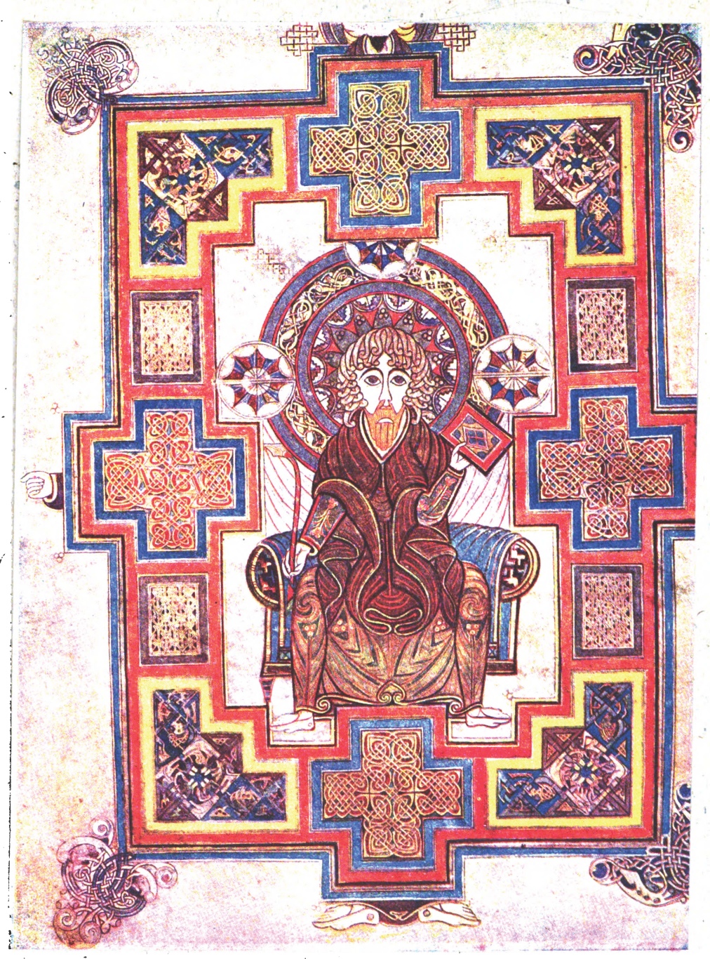
After examining “A Portrait of St. John” from the Book of Kells by Edward Sullivan for examples of design principals, I was completely amazed at how this artist was so in tune with the need for color and balance. The details in the designs are stunning. I feel that our society is unaware of the challenges that would be faced in trying to create such detail by hand. What a difficult and laborious process! Although the creation of illustrations have come a long way since then, it is still important to respect the beauty of the ancient work.
When viewing this ancient manuscript, it was very easy to locate the four principals of design. My findings are as follows:
1. Contrast-the vibrant colors of the Celtic from are contrasting with lightly colored background.
2. Repetition-is the predominant design principal in this manuscript. The entire work is a series of patterns. The frame, clothing, chair and background all depict repeating designs.
3. Alignment-since the piece is symmetrical, the entire work is aligned vertically and horizontally. Imaginary lines could be drawn to show complete symmetry.
4. Proximity-the artist did group like objects together. The designs around the “throne” are all equally place around the chair. The Celtic knots on the corners of the frame are also in the same areas throughout the piece.
Edward Sullivan, the creator of the manuscript book, took the time to give the readers insight into the story behind the transcripts. He organizes the information by title page, prefatory note, preface, list of plates and the introduction. He provides an understanding of the location of Kells and the detail on how the Abbey came about.
Reference
Sullivan, E. (2010). The Book of Kells . Retrieved November 14, 2010, from Internet Sacred Text Archive: http://www.sacred-texts.com/neu/celt/bok/index.htm
Image URL: http://www.sacred-texts.com/neu/celt/bok/img/pl18.jpg
Subscribe to:
Post Comments (Atom)

No comments:
Post a Comment